
Every online store is different, but all sellers have one thing in common—the desire to increase sales.
“How to increase sales,” “increase conversion rates,” and “how to increase visits to your site” are among the most common online searches, often accompanied by the term “WooCommerce checkout.”
There are two reasons for this. First, every WooCommerce store, no matter how successful, can improve. Second, the checkout process is the most important part of the entire purchasing process.
If this page is not optimized, all your efforts and investments in attracting visitors to your WordPress site could be wasted.
The average cart abandonment rate for eCommerce is estimated to exceed 70%. This means that 7 out of 10 people you attract to your site and captivate with your products and/or services will leave without completing payment.
This often occurs at checkout, one step before the purchase is completed.
In this article, we will explore how you can optimize your online store by improving the checkout experience and maximizing sales.
Table of contents
- Reduce Form Fields to an "Ideal" Level
- Make Guest Checkout the Most Obvious Option
- Use a Single Column Layout
- Implement a Multi-Step Checkout With a Progress Indicator
- Use Inline Validation to Correct Errors in Real Time
- Maximize Trust at the Point of Payment
- Provide an Estimated Delivery Date, Not a Time Frame
- Optimize Payment Form Details
- Remove Distractions, Such as Headers and Footers
- What About Past Customers? WooCommerce Direct Checkout
- Conclusion and Next Steps
Reduce Form Fields to an “Ideal” Level
Why does the checkout process often become such a major obstacle to the success of our online store? There are generally two reasons:
- First, errors occur during the checkout process, preventing customers from completing their purchase. Not everyone has the patience to try again, and any problems in the purchasing process can easily undermine potential customers’ trust in you.
- Second, the default WooCommerce checkout page is complex and not necessarily optimized or effective.
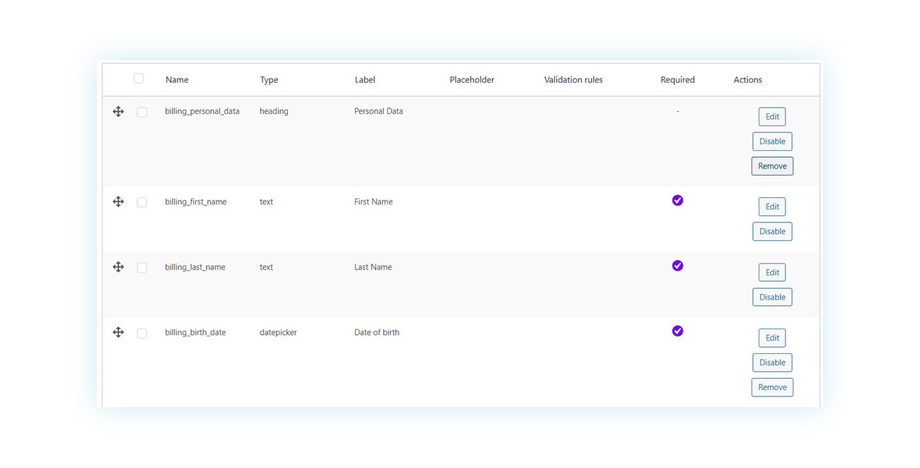
How can it be optimized? A great place to start is by reducing the number of unnecessary fields in the checkout process. According to Baymard’s research, users attribute a complexity value to the checkout process based on how many fields they are required to fill in. Ideally, there should be no more than seven fields, yet most checkouts require more than 10, creating a significant obstacle in your sales process.
How can you simplify the WooCommerce checkout page?
If your checkout experience falls into the above category, here’s what you can do:
Use a single “Full Name” field
Many checkouts have two separate fields for the customer’s first and last name. Combining them into a “Full Name” field is a great place to start. This option is faster and more inclusive because it allows customers to enter their full name, even if it has more than two parts.
Hide “Address 2” behind a link
“Address 2” is another useless field for most customers that is still present in 75% of checkouts. This additional field confuses users, who wonder whether they should split their shipping address in two or provide an additional address.
Clearly, eliminating this field altogether is not a good idea since some customers will still need to fill it out. However, making it visible only to those who need it could be beneficial.
You can modify the checkout page by hiding the field behind an option like “Add address details”.
Explain why you are asking for a phone number
In today’s society, there is a growing emphasis on privacy. Many customers may perceive the request for a phone number as invasive, especially if it is not necessary for shipping the product.
Providing a brief explanation of why this information is needed could dispel any doubts and streamline the purchasing process. Doing so could distinguish your store from the 40% that provide no explanation.
How can the checkout page be modified?
As you can see, you can significantly reduce cart abandonment by making slight modifications to the WooCommerce checkout page. However, this typically requires editing the WordPress code, which is not advised unless you have extensive experience with the tool. Even minor changes can produce unexpected results.
For this reason, we recommend using a specialized plugin like YITH WooCommerce Checkout Manager. This tool allows you to customize your checkout process by adding and modifying fields with just a few simple clicks.
Make Guest Checkout the Most Obvious Option
While having users register on your site can be beneficial to your business, it can also cause you to lose sales if the process is too complex.
Asking guest users to register before completing their purchase can create friction, distracting them from their goal and increasing the risk of cart abandonment.
For this reason, many stores offer the option to purchase a product as a guest, postponing registration to a later time (you can also find this option in WooCommerce Checkout).
Your store probably already offers this option, but it may not be very visible. About half of eCommerce sites have insufficient visibility of guest checkout, so users don’t even notice it.
Modifying the checkout page to make this option more prominent can be very beneficial, allowing users to create an account with a single click using the data they have already entered (thus exploiting the NNG principle).
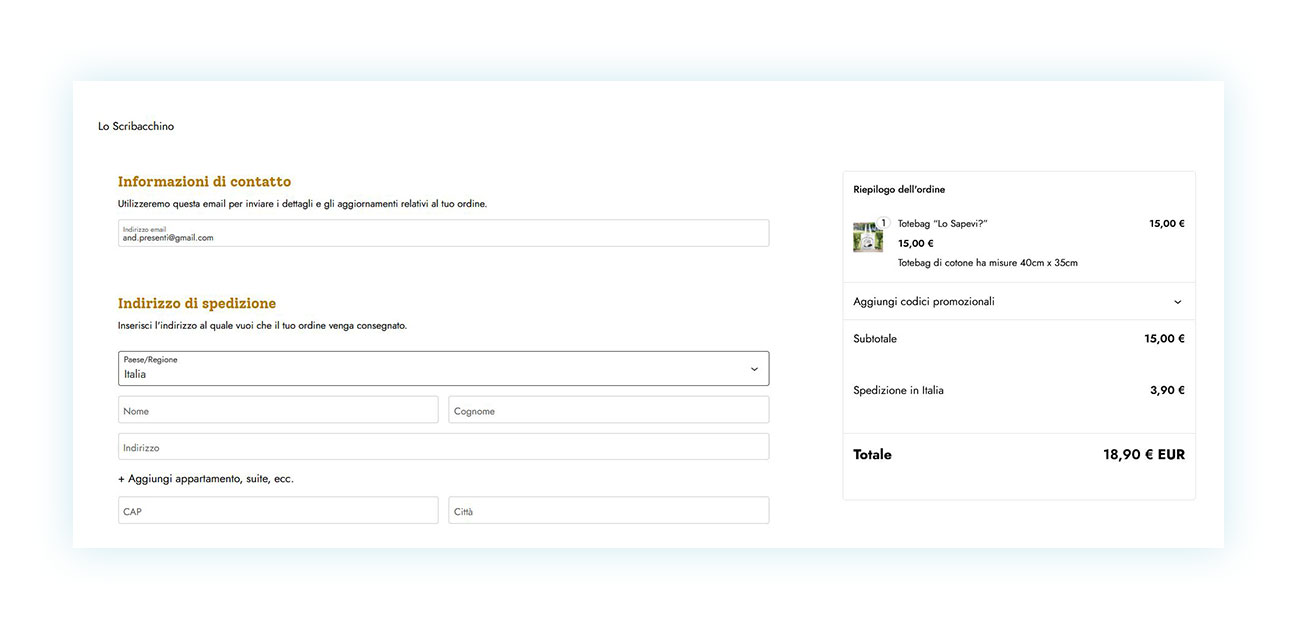
Use a Single Column Layout
It is common to see checkout pages that divide input fields into several columns. While this may simplify the process, a study by the Nielsen Norman Group has shown that multiple columns increase the risk of errors and require users to re-enter data, testing their patience.
Ideally, arrange all form fields in a single, logical column so that users only have to scroll from top to bottom, not left to right. This is also ideal for mobile navigation, which is becoming increasingly common.
The only cases in which two fields can be on the same line are those that are closely related, such as an address and house number.
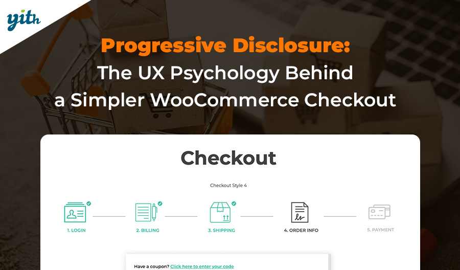
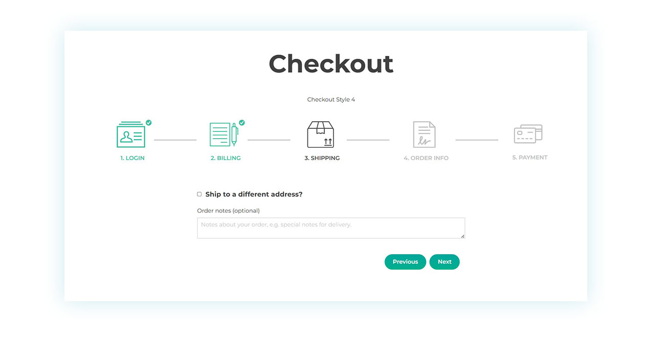
Implement a Multi-Step Checkout With a Progress Indicator
If you want to simplify the checkout process, consider breaking it down into steps. This way, customers won’t be overwhelmed by too much text and fields to fill out, which could discourage them from continuing.
In fact, research shows that breaking a long process into smaller steps reduces cognitive load, minimizes errors, and gives users a sense of control by showing them how much is left to complete the process.
WooCommerce breaks down its configuration wizard into several steps to simplify the initial user experience.
How can you introduce a multi-step checkout process to your eCommerce site?
Once again, you can use a specialized plugin to divide your checkout process into multiple steps. One option is the YITH WooCommerce Multi-step Checkout plugin.
With just a few clicks, you can customize the checkout process however you like. Follow these tips to make the most of this feature:
- Keep it simple: don’t include dozens of steps. Try to limit them to three or four main steps; otherwise, you risk fragmenting the user experience.
- Be clear: Highlight the current step so the user knows where they are in the checkout process and isn’t confused.
Use Inline Validation to Correct Errors in Real Time
There is nothing more frustrating for a potential customer than clicking the payment button and getting stuck on the same page due to an error when filling out the form.
It’s even worse if the process forces them to re-enter data they had already entered.
How can you solve this problem?
Use inline validation. In other words, allow the system to confirm whether the data entered in a field is correct as soon as it is filled in. If not, an error message will appear, and the field will turn red.
This allows the customer to correct the error immediately, rather than reaching the end of the checkout process convinced that they have not made any mistakes.
For example, if the user forgets the @ symbol in the email field, an error message will appear. The field turns red, and a message may appear that says: “Enter a valid email address”.
Maximize Trust at the Point of Payment
The internet can be a dangerous place, so it’s important to understand how to earn the trust of potential customers. Without trust, it can be difficult to get customers to make a payment.
For this reason, we recommend using visual cues to reassure hesitant customers.
How can you inspire confidence?
Most customers who visit your online store are likely familiar with shopping on other eCommerce sites and platforms, such as Amazon, eBay, and AliExpress.
They will look for familiar symbols that can reassure them. One such symbol is the SSL certificate, which is absolutely necessary for selling online.
EEven if the average user doesn’t know what an SSL certificate is, they recognize the symbol as representing quality and security. Placing the symbol near the payment area and in the footer of the WooCommerce site can be very beneficial.
This is also the case for logos of popular payment methods in your country. For example, PayPal is known for its payment security.
You can also add a statement or logo confirming that purchases are secure and that data is encrypted. You can also inform users of your refund and replacement policies.
Provide an Estimated Delivery Date, Not a Time Frame
Many customers dislike not knowing exactly when will their product arrive. Seeing “Delivery in 3-5 business days” forces the user to do calculations, speculations about what constitutes a business day, holidays, and the actual arrival of the product.
What to do?
Introduce a clearer system and specify the delivery day clearly. If you find it difficult to be 100% certain, you can say: “Estimated delivery: Tuesday, August 12,” which gives you some shipping flexibility (but be careful because delivery delays greatly undermine customer satisfaction).
In any case, saying “Delivery between August 12 and 14” is preferable to “Delivery in 2-3 days.” This type of message also helps you increase the value of any express shipping options.
Optimize Payment Form Details
There are many details that can affect how customers perceive you. Let’s look at a few:
- Make sure explanatory labels above fields do not disappear when users click to enter data. Otherwise, users will have to click elsewhere, which moves the cursor and slows down the purchase process.
- Use the same format for the credit card expiration date. If the expiration date on the card is listed as MM/YY, ask for these values in the same order on your site.
- Almost everyone is familiar with the CVV field, but don’t underestimate the lack of experience. Providing a message or small image that specifies the location of this value on the card can help less experienced users.
Remove Distractions, Such as Headers and Footers
Ideally, your checkout page should have as few distractions as possible, so remove anything unnecessary. The page should resemble a tunnel with one exit: the payment button.
Remove all other options, such as those in the header menu or footer links. You may add a low-visibility “Back” button to allow customers to return to the previous page, but keep the checkout page as clean as possible.
A theme to clean up your checkout page
If you don’t know how to implement this feature, you can use a professional theme that offers a “distraction-free checkout” option with one click.
As you can see, the checkout page has no unnecessary or distracting links. This screenshot was taken from the Wonder theme, which offers this feature. You can also find it directly on your WordPress site by going to Themes and searching for “Wonder” in the database.
What About Past Customers? WooCommerce Direct Checkout
While it’s important to win over new customers, it’s also important to offer something to those who have already placed their trust in you.
Use a plugin like YITH WooCommerce One-Click Checkout to let customers complete a purchase with a single click without going through the entire confirmation process again.
Even industry leaders such as Amazon have introduced this feature!
Conclusion and Next Steps
Optimizing the WooCommerce checkout process doesn’t mean reinventing the wheel; it means applying proven usability principles. Often, people look for extraordinary methods, powerful tools, or miraculous solutions to increase their sales when, in reality, success lies in the details.
It’s all about making things clear, simple, and trustworthy. That’s how we turn the WooCommerce checkout page from a roadblock into a tool for boosting sales. If you want your online store to really shine, you’ve got to keep tweaking it.
Many of the changes discussed, such as reducing form fields, using single-column layouts, and introducing real-time validation, may seem minor, but they significantly impact user behavior. Remember that the checkout experience is the final step in the customer’s journey. Any friction, doubt, or distraction at this stage can result in a lost sale. It is also the most vulnerable stage for customers buying from your site for the first time.
Their insecurities and doubts will come to the forefront, so address them one by one.
The good news is that you don’t have to implement everything at once. Start today by choosing one of the nine best practices that seems easiest to implement, then measure its impact on your conversion rate. Even a single change towards an optimized checkout can lead to surprising results.
If you want to take a step further in your WooCommerce checkout page customization, and introduce a strategy that can transform the way your customers perceive your checkout page, try the YITH WooCommerce Multi-Step Checkout plugin. In less than five minutes, you can create a clear, organized, and reassuring multi-step process for your customers.