An eCommerce store, like any other tool, needs to be optimized in every detail. Just like an axe with a razor-sharp blade but a cracked handle, even the best-looking online store won’t reach its full potential if the pages that make up the buying journey aren’t properly tuned.
And among all of them, one page matters more than most: the checkout.
If a customer reaches the checkout, it means you’ve already done a great job. You guided them through the available options, convinced them to add a product to their cart, and built enough trust for them to consider paying.
And yet, all of that effort can fall apart right here.
Just like the axe that breaks on the first swing—despite hours spent sharpening the blade—your store can collapse at the very last step.
There are many reasons behind cart abandonment, but one of the most common is checkout complexity. The user arrives ready to pay, only to face an endless form with 20 fields all at once: name, address, shipping, notes, privacy, credit card details… everything, everywhere. This is a classic example of complex information presented all at once, which can be difficult for users to process.
This can easily overwhelm users, especially if they already went through an internal debate before deciding to buy. This phenomenon is called Cognitive Load. The brain perceives the task as “hard” and “mentally demanding.”
The result? Cart abandonment.
But here’s the catch: you do need that information to ship the product. So what’s the solution?
The answer lies in Progressive Disclosure—showing information only when the user needs it, not all at once.
In this article, we’ll explore how to apply this approach to a WooCommerce-based eCommerce store.
Table of contents
- What Is Progressive Disclosure (and Why It Improves User Experience and Saves Sales)
- Approach 1: Break the Long Form into Smaller Steps (Multi-Step Checkout)
- Approach 2: Hide Irrelevant Fields Using Conditional Logic to Reduce User Errors
- Approach 3: Show Only Relevant Options
- How to Implement the Full Strategy with YITH (The “Combo”)
- Conclusion: Less Is More
What Is Progressive Disclosure (and Why It Improves User Experience and Saves Sales)
Progressive Disclosure is the art of sequencing information. Instead of showing everything upfront, you guide the user step by step, gradually revealing information or features as they move through the process.
Most people feel intimidated by a wall of questions—not only because of the amount of work involved, but also because of the idea of sharing so much personal information all at once.
So what do we do?
We break the journey into smaller, manageable steps—without losing any of the critical information your business needs. The most common example of progressive disclosure is a multi-step form, typically used for eCommerce checkouts.
In the checkout, this approach significantly reduces anxiety and makes the process feel shorter and more manageable, leading to a noticeable drop in cart abandonment.
Let’s see how you can apply this in practice.
Approach 1: Break the Long Form into Smaller Steps (Multi-Step Checkout)
One of the most common mistakes in WooCommerce stores is relying entirely on the platform’s default features. WooCommerce has massive potential, but to unlock it, some things—especially the checkout—need refinement.
By default, WooCommerce groups all checkout fields into a single page, creating what’s essentially a chunking problem. It’s like throwing everything into a closet while tidying up your house—later, you can’t find anything.
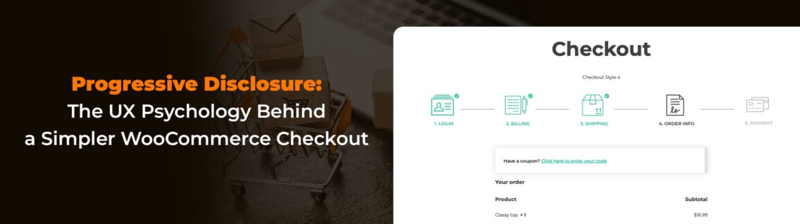
The solution? Use YITH WooCommerce Multi-step Checkout:
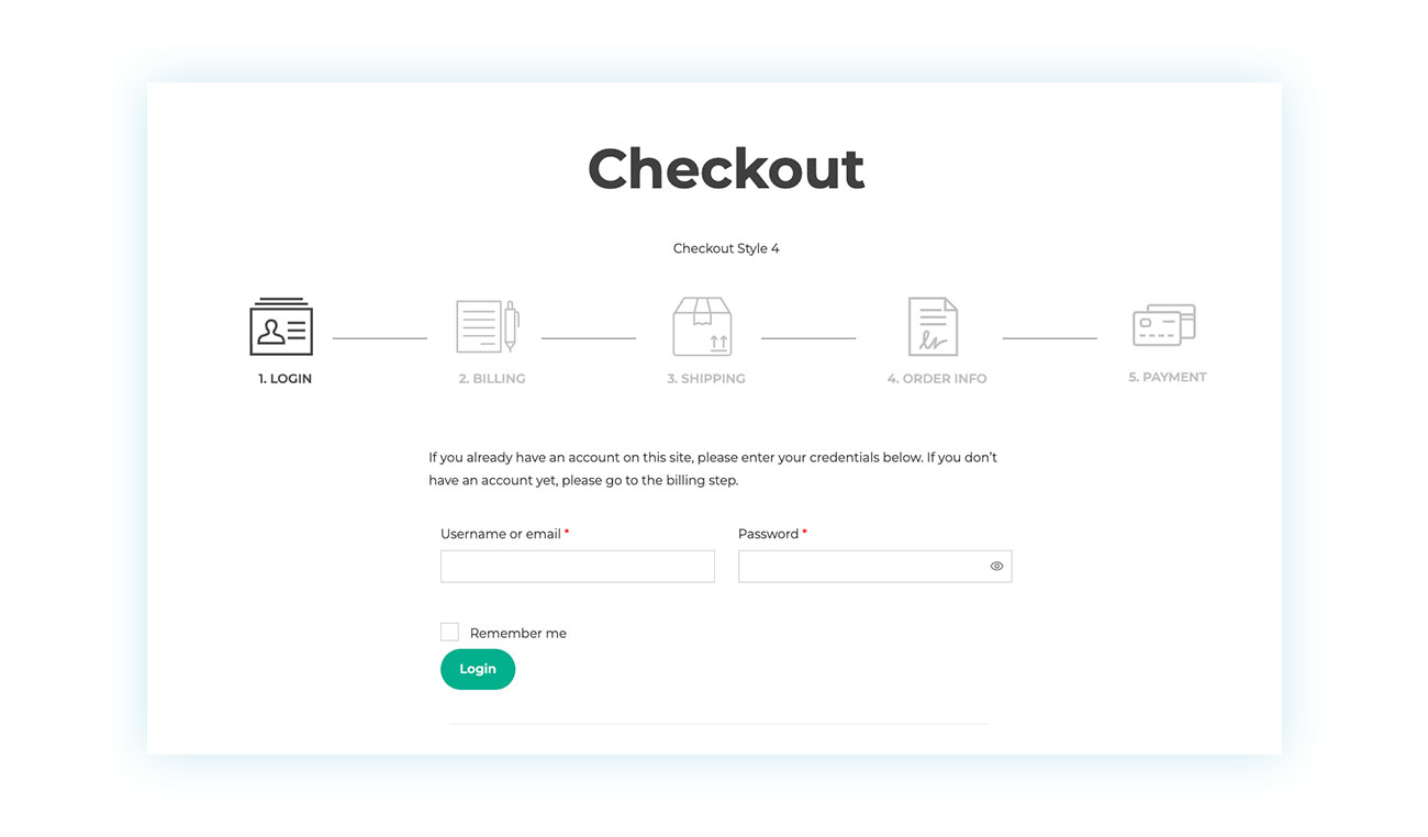
This plugin splits the process into clear steps, such as: 1. Login / Customer details → 2. Shipping → 3. Payment …and so on.
This way, customers focus on one decision at a time. Additionally, a progress bar motivates them to keep going (“I’m almost there!”), while completed steps create a reassuring sense of momentum.
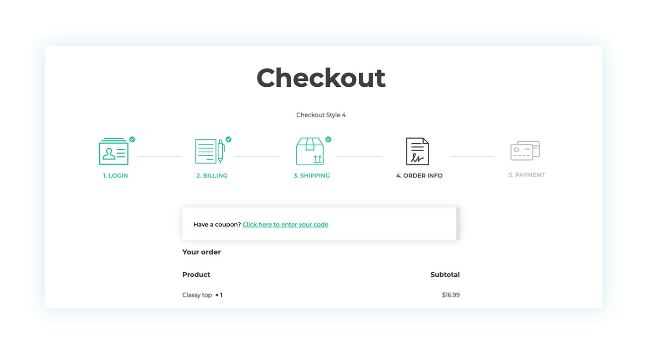
Compared to WooCommerce’s default text-heavy checkout, this approach feels instantly more welcoming and user-friendly.
Approach 2: Hide Irrelevant Fields Using Conditional Logic to Reduce User Errors
Once the checkout feels more approachable, the work isn’t over.
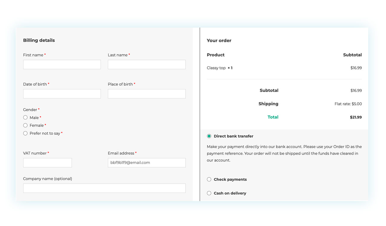
The traditional WooCommerce checkout includes many fields—but not all of them are always useful for your business or every customer.
Almost every store owner ends up wanting to add, remove, or adjust checkout fields. And even when all the requested information is necessary, you can still improve how it’s presented.
How? With conditional logic.
Conditional logic means hiding certain fields and only displaying them when the customer actually needs to fill them out, based on user inputs. WooCommerce already uses this concept with billing and shipping addresses.
Typically, customers fill in their billing address and then see a checkbox:
“Shipping address is different from billing address?”
If they check it, the shipping fields appear. If not, they never see them—and aren’t overwhelmed by unnecessary inputs. This process relies on user clicks to reveal or hide additional fields, making the experience more efficient and tailored.
To add, remove, or apply conditional logic to checkout fields, we recommend YITH WooCommerce Checkout Manager, which lets you fully customize the checkout based on your needs.
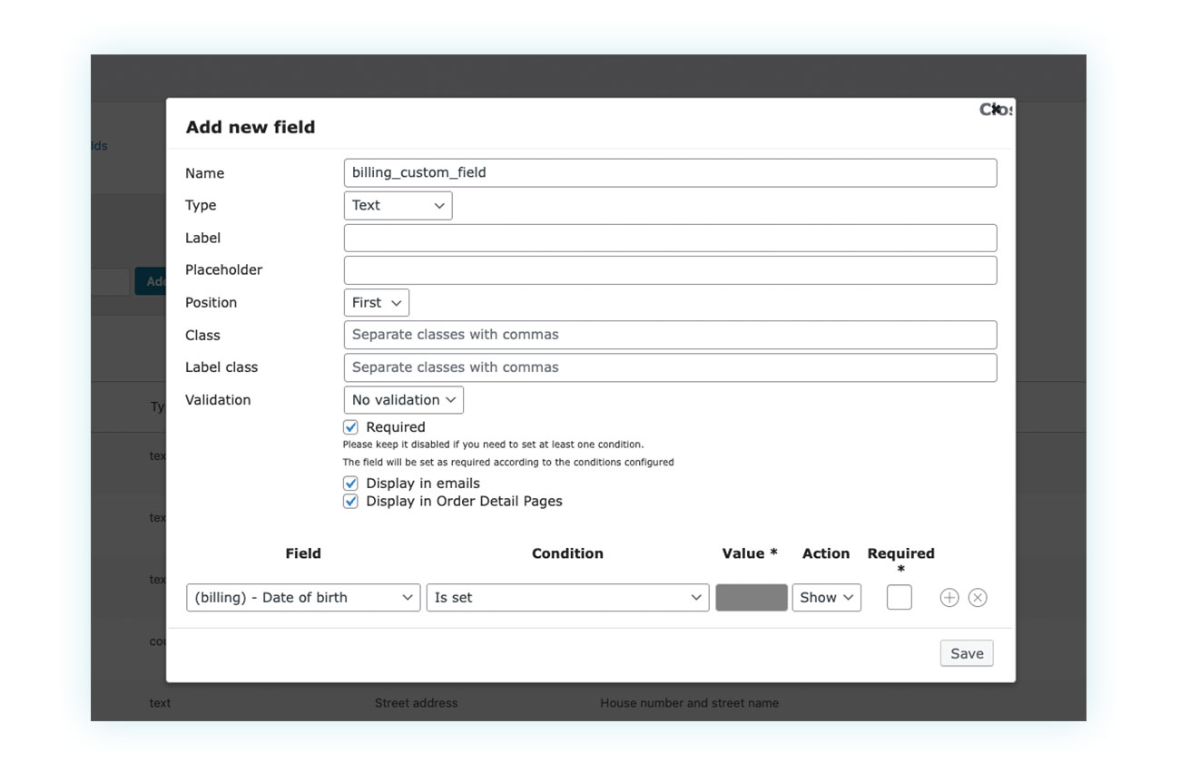
For example, you can start by asking:
“Are you a private individual or a business?”
- If they choose Private Individual → hide all tax-related fields
- If they choose Business → progressively reveal VAT ID and business-related fields.
UI patterns like accordions are also commonly used for progressive disclosure. Accordions give users control over when and if they need content, helping to present a lot of information without overwhelming them.
This gives you full control over what users see, and when they see it.
Approach 3: Show Only Relevant Options
Conditional logic isn’t just for form fields—it applies to options too.
In general, you should only show information when you’re sure it’s relevant. This is where organizing information becomes crucial—structuring options in a user-friendly way helps prevent confusion and guides users smoothly through the process.
For example, while registered users are valuable, never underestimate the importance of guest checkouts. Many first-time customers don’t want the commitment of creating an account, and seeing fields like “username” and “password” can make registration feel mandatory. Account settings, such as notification preferences or saved addresses, can also be progressively revealed only when the user chooses to create an account.
A better approach?
Show only a checkbox that says: “Would you like to create an account?”
Only if the user checks it do the password fields and relevant account settings appear.
The same applies to payment details. Don’t show credit card details until the user selects “Credit Card.” And don’t show shipping options until the address is entered—otherwise you risk frustration caused by miscalculated costs.
How to Implement the Full Strategy with YITH (The “Combo”)
So far, we’ve talked about different “applications,” but don’t think of them as alternatives. They’re meant to work together.
To implement progressive Ddisclosure effectively as a UX design strategy, both tools are required:
- Multi-step Checkout for the macro structure (horizontal steps).
This prevents the intimidating “wall of text” effect that can scare off even motivated customers. - Checkout Manager for micro-level cleanup (showing and hiding fields within each step).
This further simplifies the process without asking for more information than strictly necessary.
Combined, they allow you to deliver a smooth, “Shopify-like” checkout experience—one that converts better.
Conclusion: Less Is More
By now, the key idea should be clear: the checkout isn’t just a form—it’s the final and most delicate conversation between you and your customer.
It’s the moment when the trust built throughout the journey can turn into a sale… or vanish in seconds.
Progressive Disclosure isn’t a UX trend—it’s a direct response to how the human brain works. Reducing cognitive load means removing invisible obstacles, lowering stress, and making action feel natural.
A customer who sees a clear, short, and understandable path is far more likely to continue rather than think, “I’ll do it later.”
Never underestimate the effort customers make just to reach the checkout. Every page introduces a bit of friction, and once they’re ready to pay, your job is to remove as much resistance as possible.
Breaking the checkout into steps, hiding unnecessary fields, and showing only relevant options at the right time all communicate one thing: respect.
Respect for the user’s time, attention, and mental energy. And when an eCommerce store shows respect, it’s rewarded with higher conversions and fewer abandoned carts.
WooCommerce provides a solid but rough foundation. It’s up to you to refine it into a smooth, modern, competitive experience. With the right tools—like YITH’s Multi-step Checkout and Checkout Manager—you can apply Progressive Disclosure strategically and consistently, creating a checkout that feels lightweight, reassuring, and conversion-focused.
In the end, remember this:
You don’t need to ask for less information—you need to ask for it better.