
A lot of sellers with their own eCommerce stores search for ways to improve their sites and increase sales. Most of the guides you can find online focus on increasing website speed and integrating responsive design for mobile users, given that more and more people are browsing exclusively on their mobile phones.
These two aspects are certainly important, but they’re not the only ones. In fact, the real difference is often in other places. Specifically, in the User Experience, or UX for short.
So, what’s UX? This general term refers to all the steps taken to make the purchasing process simple, easy, and enjoyable, and to solve any doubts and potential causes of friction.
In this guide, we’re going to go beyond the usual advice and give you a step-by-step plan.
Are you wondering how to improve the UX of WooCommerce? This article’s got seven techniques to boost your conversions and your customer experience.
We’ll show you how to do it, why it’s important, and how to add these tools to your WooCommerce store.
Then, we’ll follow in your customers’ footsteps to see what can be improved and where:
- and 2. By taking these first two steps, we’ll make your eCommerce website so easy to use that your potential customers will be able to find the product they want to buy in just a few seconds.
- In the third step, we’ll look at how to show products without overwhelming the customer and forcing them to open multiple tabs in their browser.
- In the fourth step, we’ll talk about how to communicate clearly with the customer to reduce errors and dissatisfaction.
- In the fifth step, we’ll look at how to predict customer questions and concerns, and answer them before they even cross their minds.
- In the sixth step, we’ll work on making the checkout process as smooth as possible so that we don’t lose too many sales.
- In the seventh step, we’ll create a personal hub for the customer right on their “My Account” page to make sure they come back and buy again.
Table of contents
- Technique 1: Turn your search from a dead end into a red carpet
- Technique 2: Simplify the discovery of your eCommerce site with smart (and instant) filters
- Technique 3: Reduce decision fatigue with a quick preview
- Technique 4: Provide clear and useful feedback after "Add to Cart"
- Technique 5: Answer questions before they become doubts
- Technique 6: Make the checkout process less intimidating by breaking it down into steps
- Technique 7: Transform the “My Account” area from a service page to a personal hub
- Conclusion: Small changes, big impact
Technique 1: Turn your search from a dead end into a red carpet
First, it’s important to guide potential customers to the products they’re looking for. By this, we don’t mean techniques for increasing traffic to your site; but rather, internal navigation.
While WordPress and WooCommerce make creating an online store easy, that doesn’t mean it’s optimized. Browsing the catalog is cumbersome, forcing customers to perform multiple searches and wasting their time and patience, which ultimately causes them to abandon your site.
If your store only has a few products, you might not have to worry about this. Otherwise, it’s important to use a “live” and intelligent search method that shows relevant results in real time, suggesting products, categories, tags, and more.
Any ideas on how to do that? You can use the YITH WooCommerce Ajax Search plugin.
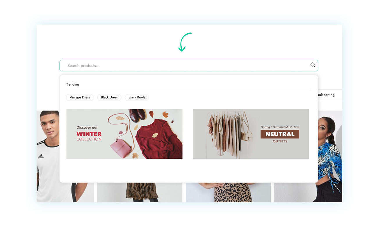
The plugin has a free version with fewer features if you want to try it before buying, but it creates a smart, dynamic search bar that displays results in real time based on what the user types.
For example, when searching for “black dress,” here are the results that appear without having to reload the page:

As you can see, the search bar gives you a lightning-fast browsing experience, showing high quality images, prices, names, descriptions, number of products, and everything else your potential customer might need.
You can customize the search bar to suit your needs. You can choose what to display, how many characters you want to see before the first results appear, and much more.
Technique 2: Simplify the discovery of your eCommerce site with smart (and instant) filters
Let’s keep talking about navigation and catalog browsing issues. If a store has a large number of products, the shop page and category pages can be confusing, forcing customers to scroll endlessly to find the product they’re looking for.
But customers’ patience is limited, and the longer it takes them to find the product, the less likely they are to buy.
In this case, too, you want to offer an immediate and intelligent filtering experience using the YITH WooCommerce Ajax Product Filter plugin.
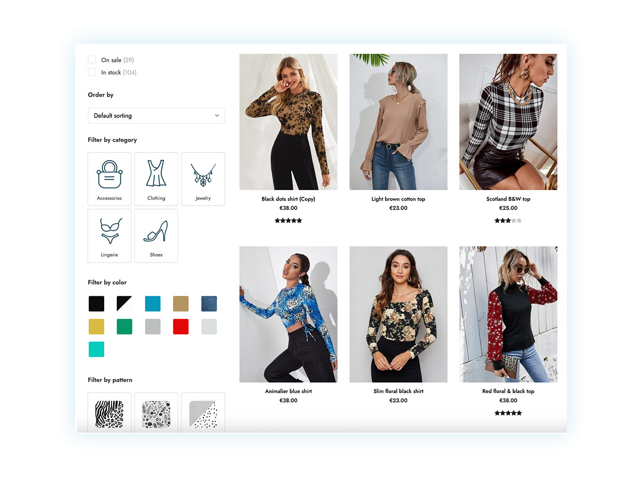
With YITH WooCommerce Ajax Product Filter, you can create advanced, customizable filter areas. Users can combine multiple filters and instantly see the results, making browsing the catalog a smooth and satisfying experience.
While most eCommerce stores can benefit from it, it is especially useful for those with a wide range of products and variations, such as clothing stores. Users who can only wear one size have no reason to view the rest. Seeing products that are too small or large can be an extremely frustrating experience.
Technique 3: Reduce decision fatigue with a quick preview
We’ve made browsing the catalog quick and easy, but there’s still one step that bums out the user experience: viewing product details.
With the filters set, the customer only sees 10 options instead of 1,000. But these 10 will still require them to open as many pages or tabs, creating a cumbersome back-and-forth process that can easily push them towards abandoning their cart.
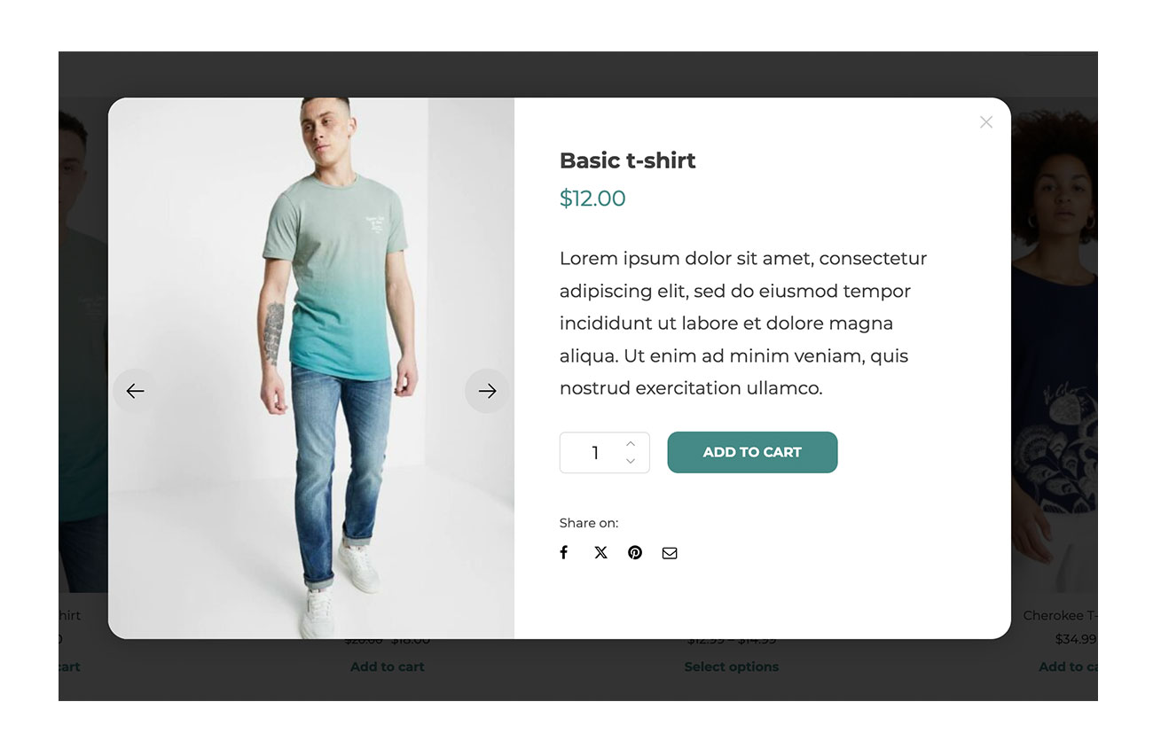
Any ideas on how to solve this? Give customers the chance to check out a product in more detail right on the catalog page by using a plugin like YITH WooCommerce Quick View:
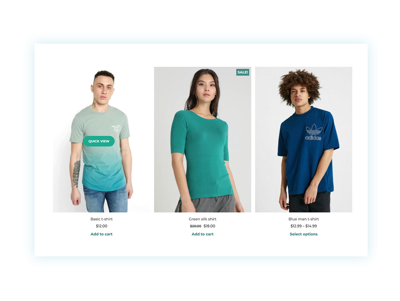
This tool adds a button to each product in the shop loop. With one click, users can view a gallery of images, read a brief description, and add the product to their cart, all without ever leaving the page they’re on:
Technique 4: Provide clear and useful feedback after “Add to Cart”
You helped your customer find the right product for them. You convinced them to add it to their cart by quickly showing them all the product features.
But this is where other problems come up. After clicking “Add to cart,” the WooCommerce notification is small and at the top of the store page. A lot of users don’t even notice it, so they keep clicking it over and over, totally confused.
This isn’t what customers expect from a professional eCommerce site. It can end up annoying them and cause them to leave the site, or it can result in their carts full of products they don’t want… a total mess.
So, what should you do? Use a modal popup that’s clear and obvious once the product is added to the cart. You can do this with the YITH WooCommerce Added to Cart Popup plugin.
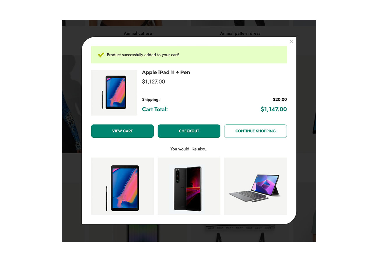
With a quick tweak, you can boost this important micro-interaction. It gives you immediate visual feedback and can also show related products (cross-sell), which encourages the user to increase the value of their cart.
Technique 5: Answer questions before they become doubts
The purchasing process is rarely as smooth as a store owner would like it to be. When you’re looking at products, you might have doubts and uncertainties because of your own or other people’s past experiences.
That’s why it’s common to look for answers to these questions on the product page. Especially since huge companies like Amazon have introduced a Questions and Answers system for their products. If there’s no solution, customers either have to read reviews or leave the page to find the answer somewhere else.
Let’s look at how to add a similar system to your online store to increase WooCommerce sales. First, you’ll need to use the YITH WooCommerce Questions and Answers plugin.
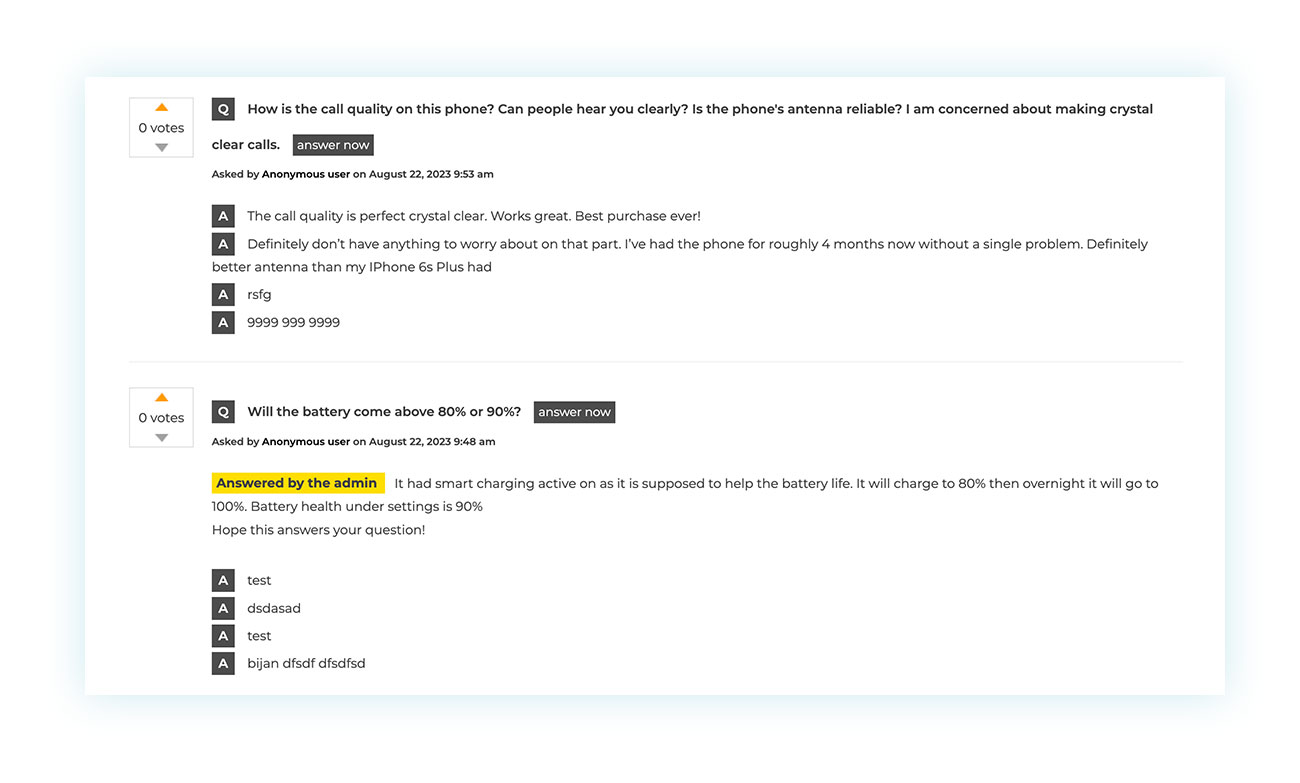
It’s just like on Amazon, where the plugin adds a “Q&A” tab to each product. This gives proactive support that instantly removes doubts and creates useful content (UGC) that helps future customers make informed decisions.
If a customer has a question about a product, you can answer it yourself or let customers interact and answer each other’s questions. Direct testimonials from various people exploit the Principle of Social Proof, which boosts customer confidence and makes products more appealing.
Technique 6: Make the checkout process less intimidating by breaking it down into steps
Things are going really well! You’ve convinced your customer to buy your product, got them to add it to their cart, and now they’re on the Checkout page.
This page is a big deal in the buying process, and it’s the one where the most people drop out. A long list of fields in a checkout flow can seem like a big obstacle, causing customers to become anxious and abandon their purchases.
There are several solutions to address this problem. The most effective solution is the creation of a multi-step system that divides the checkout process into simple, logical stages, making it more user-friendly.
You can use the YITH WooCommerce Multi-step Checkout plugin to do this:
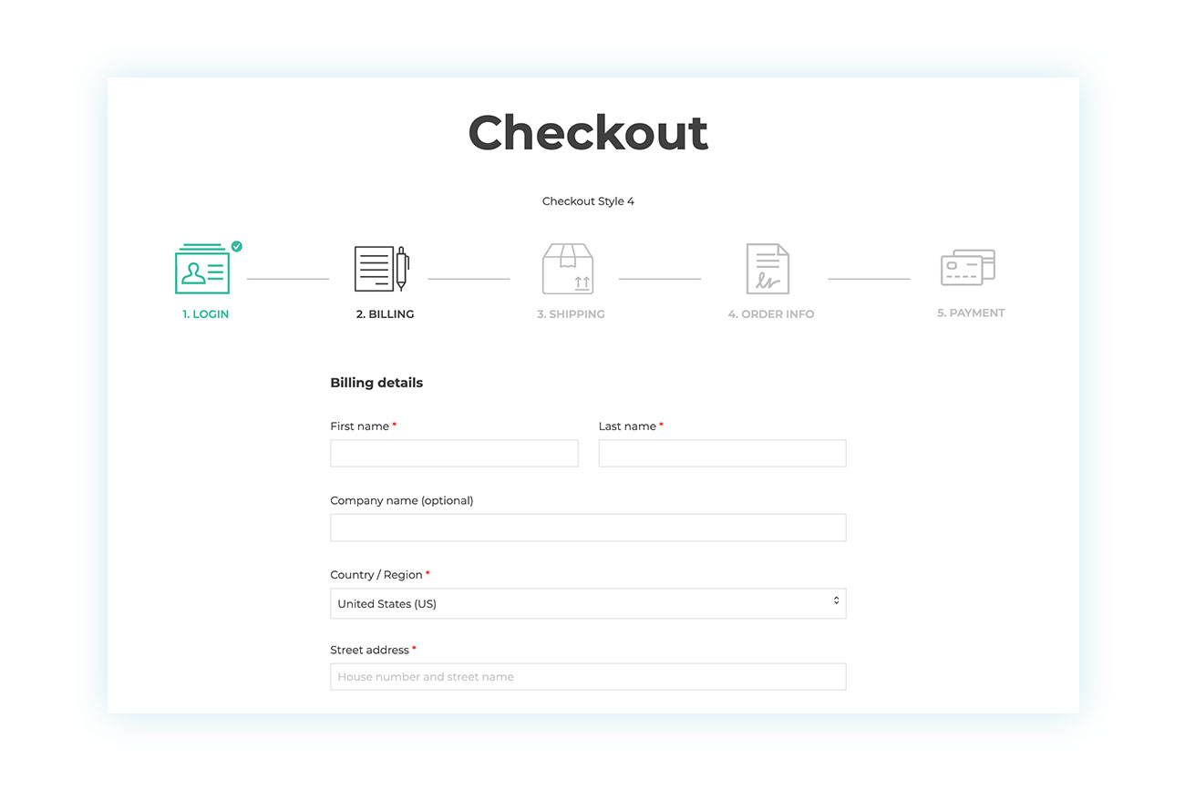
This plugin transforms the standard checkout process into a guided, intuitive experience. Users always know where they are in the process and what they need to do to complete their order, which drastically reduces friction.
There are other checkout-dedicated plugins in the YITH catalog. We recommend taking a look!
Technique 7: Transform the “My Account” area from a service page to a personal hub
Even after the sale is complete, there’s still more to do. Every customer has the potential to make repeat purchases, so it’s important to follow up with them after they make a purchase.
Most customers, for example, will visit their “My Account” page to find info about their purchase. The page created by WooCommerce is functional, but it’s also generic and impersonal.
A lot of sellers don’t realize the potential of this page, but you can turn it into a hub for communicating with your customers. You can customize the content to make it look nice and add useful sections like quick links, exclusive promotions, or a summary of loyalty points (if you have a loyalty program). This can boost customer satisfaction and create a more welcoming atmosphere.
To do this, use the YITH WooCommerce Customize My Account Page plugin.
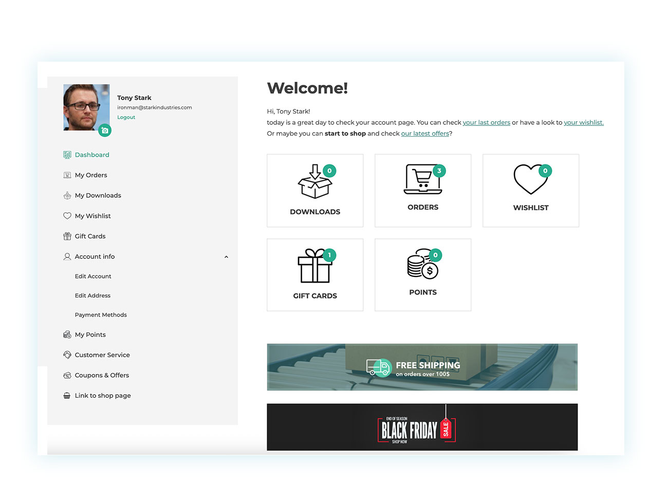
The plugin gives you full control over this section. You can add new “endpoints” (like “My wishlists” and “My coupons”), insert promotional banners, and create a personalized experience that makes existing customers feel appreciated and special.
Conclusion: Small changes, big impact
The user experience is not one major optimization but rather the sum of many small details that have been carefully considered. Although this may seem daunting, you can start seeing results from the first step you take. Gradually transform your WooCommerce site into a money-making machine!
The seven often-overlooked techniques we have examined have a significant cumulative impact on conversions and brand perception. Therefore, you should not view plugins as individual entities that work independently of each other. Instead, view them as a complete toolkit for building a superior shopping experience.
Start by choosing one of these techniques and implementing it today. Visit YITH to learn how our tools can help you create a store that will highly attract customers.