
If we were to compare the sales process to a sport, then it would be a marathon: in order to sell an item you need an adequate level of preparation which will allow you to get your customers’ attention and encourage them to purchase.
You need to approach each step carefully in order to avoid stopping half through it and the hardest part of this challenge is always when you are, or in technical terms, the checkout process.
This last part of the purchase process is very important for your sales, just consider that more than 88% of your customers doesn’t complete the checkout process they begin.
If this number seems shocking, you need to understand that it also represents a great potential to increase sales on your store.
I have talked at length about the checkout process in previous articles, but this time I speak on behalf of somebody that has way more experience in this field than me: Jakob Nielsen.
Nielsen is an expert in the field of usability and user experience for websites, among the many usability studies he performed over the years, he performed one that was entirely dedicate to the e-commerce world: “Ecommerce User Experience”.
The New York Times called him the “Guru of web pages usability”, Nielsen is known worldwide and his knowledge in the field of online sales is such that his consultancies cost tens of thousands of dollars.
We all have something to learn from a person like him and I’m going to use this article to analyze six guidelines that Nielsen pointed out in order to improve the purchase process.
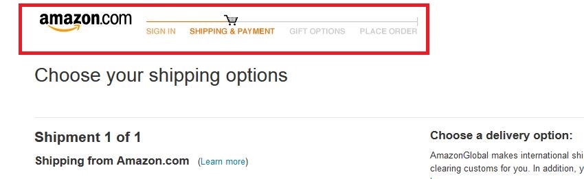
As you can see I decided to use Amazon as a point of reference, in order to show you how these tips are being used by the leaders in the market.
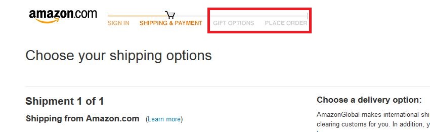
1) Show your customers how far they have reached in the purchase process
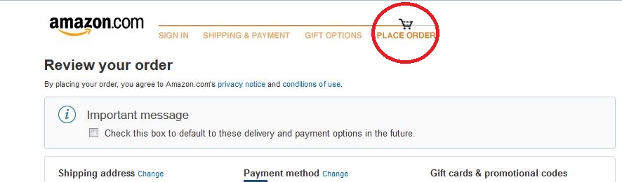
Showing a progress bar in the discount process is useful in order to make each step clear to our customers.
Clearly this step is pointless if our customers don’t understand the step they are currently going through: using an ineffective tool can damage your sales and make your customers feel frustrated and abandon their cart.
That’s why it’s important to display which part of the checkout process your customers are going through at the moment, just like Amazon does: the icon of a cart over the active step makes everything clear.
2) Make your customers complete every passage before moving on to the next one
As we’ve seen in previous articles, dividing the checkout process into several steps is essential to make everything easier and more understandable to everyone.
But even in this case it’s good to tweak this system a little in order to optimize it.
One of the best ways to do so is to make your customers go through each step of the checkout before being able to move to the next step. It’s best to make them feel like they need to stay on your page a little longer rather than having to go back and start the whole process again. The checkout process is a minefield and a single step in the wrong direction could lead a customer to abandon their cart.
Una di queste mine è proprio la sensazione di tradimento che un cliente prova quando pensa di aver finito ma poi scopre di dover nuovamente inserire dei dati.
It’s also important to allow customers to go back to the previous step in order to check or corecct the data they inserted.
And considering a payment is never a lighthearted decision to take, especially if customer happen to think they might have gotten something wrong and can’t go back and check, they will end up giving up on the whole thing rather than taking a risk.
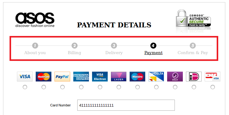
3) Show which steps are completed and which are still missing
While dividing the purchase process into different steps, it’s good to show which steps are done and which ones still need to be completed.
The progress bar is often inefficient since it only displays the number of steps in it without much detail to what they contain.
Assign a title to each step in order for the customers to understand exactly which ones are completed and which ones are missing: nobody likes to step in the dark without knowing what to expect next.
That’s how the bar won’t just show how many steps it takes to complete the purchase, but also the completed steps and the ones that are still missing.
It’s also always good to show the steps in their right order, customers are going to feel disoriented if, for instance, they are going to be asked to enter their personal data as a first step, being used to other stores in which the usual order is Data > Shipping > Payment.
4) Place the progress order on top of the page
If two of these six guidelines are about the checkout progress bar, that means it’s good to find the best way to display it clearly to customers.
Another common problems customers may experience is being unable to find what they are looking for right away: if it’s not right before their eyes, then it’s like it doesn’t even exist.
Besides, every time they get into a new step of this process, customers can look at the progress bar and have an immediate feedback about knowing how far they are from completing the checkout process.
5) Assign different colors to inactive steps
When you divide the checkout process into several steps, it’s important for customers not to get confused about which steps they completed, which are still missing and which one they are currently on in that very moment.
Nielsen recommends to use faded colors such as gray for inactive processes, in order to immediately spot which steps are active and which ones are not.
Let the least possible amount of processes be active in your clients’ minds and they will be able to fully dedicate themselves to the purchase, without getting tired or distracted.
6) Assign a number and a color to each step
While it’s true that using faded colors for inactive checkout steps it’s important, the opposite is just as relevant: use bright colors to show an active step and use contrast to guide your customers.
Using numbers to indicate each passage also serves several purposes we have gone through in the previous points: it shows how many passages are completed and how many are still missing before the end of the whole process.
Before concluding, here’s a few tips about the things you should NOT do:
- Pay attention to your choice of colors for active and inactive steps in order to keep them clearly visible and readable.
- Avoid applying a time limit for completing the checkout, it might make your customers feel pressured and make you lose several transactions.
These might seem like small tweaks, but they can definitely make a difference on your website’s conversion rate!