Use YITH WooCommerce Multi-step Checkout to split your checkout process in more pages so that users can understand immediately what they are filling and why
In some cases checkout might become one of the worst experiences for customers in your site, especially when they have to fill a huge number of fields. You know that all those fields have to be shown and that none of them can be removed, but be that as it may, users have to fill a lot of fields and they are more likely to get confused and annoyed by the action of entering data for an almost endlessly-scrollable page. How to solve this problem without having to make checkout on your site incomplete?
Certainly, the first solution is to sort fields in different sections, such as personal data, payment method, billing details etc. However, I am almost sure that most of you have already sorted fields so that they look grouped by topic, but this is not enough and the page keeps being unchanged; in two words: too long.
Experts of user experience have, then, worked out a really clever solution that meets both customers and sellers halfway: a multi-step checkout. What does it mean exactly?
A multi-step checkout allows you to break up your checkout process over multiple pages, offer a clear layout, so that all fields conceptually bound to each other can be immediately seen in a glance and customers can focus on one step at a time. The efficacy of such a split checkout has been proved by A/B splitting tests, especially on sites dealing with higher price items, desktop shoppers, consumers who are less tech savvy, but not only. The common result was that, among customers who were directed to a multi-step checkout, those who abandoned the cart during checkout were considerably fewer.
If you want to learn more about how to reduce cart abandonment, you can find more information here.
For site owners who have a WordPress and WooCommerce shop, there is a very useful and simple tool on the market, that helps you turn your checkout process into a multi-step checkout in a simple way. A complex action that becomes easy thanks to YITH WooCommerce Multi-step Checkout, a plugin for WooCommerce easy to use and with a lot of customisation options.
After having your checkout process split in more pages, you can set the number of pages or steps and give them a name. Starting from the login page where your users are asked to enter their personal data or register, and that you can optionally show or not, to billing, shipping info, order details and payment info.
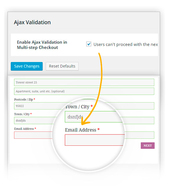
A very interesting option appears since the first steps of your checkout process. I’m talking about the possibility to highlight mandatory fields that have not been filled out. As soon as customers try to proceed to the next step, they are informed about the mandatory fields on the step they haven’t filled yet. They cannot go on and an error message informs them about incorrect or missing data in their form. All this is possible thanks to the AJAX validation option, that you can choose either to enable or not. It is all up to you, to your needs and to the way you choose to manage your checkout.
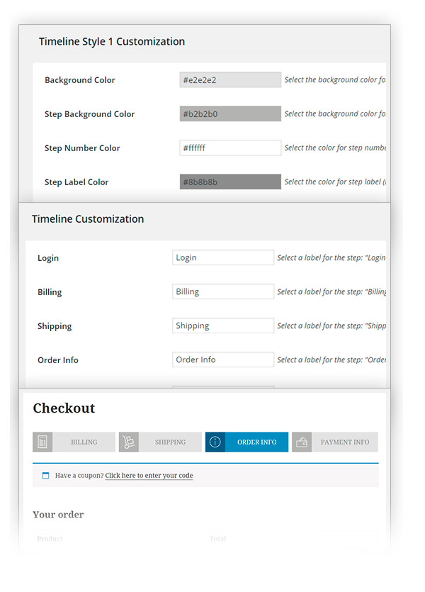
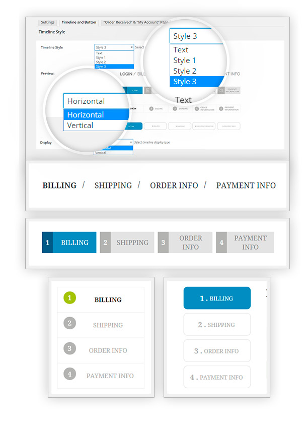
Users can immediately see the step they are on thanks to the timeline showing titles of all steps and highlighting the step through different colours. Moreover, as already anticipated above, you have lots of options at your disposal to customise your steps.
First of all, the plugin puts 3 different styles at your disposal for your timeline which default colours have been explicitly conceived to make your timeline clear about the step customers are on. Yet, you can also customise each single part of the steps, colours, borders, image and this for each single step. It is easier done than said, you can just give a try the unlimited customisation options available for each style.
However, each style has been conceived to adapt to the style of your site, from neat and austere ones to lighter and fresher ones. You can also choose to show, next to the step label, either an identifying number or an icon. What’s better than an icon to give an immediate idea of the type of information customers are going to enter there?
And style customisation does not stop there. You can also change the label for each step and choose to display your timeline as a vertical sequence of steps, instead that the usual horizontal sorting. Try the best combination for your site to make it as usable as possible and to facilitate your customers’ checkout process.
And last but not least about customisation, you can also find a list of options to customise “My order” and “Thank you” pages, so that they can have the style of your checkout timeline or the style of your theme, plus an additional list of options to make it exactly as you were planning it to be. Moreover, if you want to customize your site “My Account” page, you can find more information in this page.
Moreover, in our days in which user experience has to deal with an exponential increase of mobile use, total responsivity of the timeline could not be missing. Maybe it superfluous to make you think about that, but a non-responsive site would ruin your user experience: think of how many actions you do through your mobile phone, even purchase. I personally do not make any difference in purchasing from my mobile phone or from my laptop: the only difference for me is given by the circumstances: if my laptop is at home, I use my mobile, I don’t wait until I get back home.
So, finding a site, which is not mobile-usable, even if only in checkout step, would certainly annoy me: I have to put my purchase off to when I have a desktop PC or a laptop at a hand grasp. With YITH WooCommerce Multi-step Checkout, your customers will never bump into such problems, so you can rest easy with it.
Well, that’s all for today, I invite you to try this plugin: you will not be able to do without it anymore!


