Sometimes statistics can be surprising and when they do, that’s rarely a good thing.
For instance: did you know that the average customers only spend 15 seconds on a website? Yes, when I learned that I was shocked as well.
15 seconds is how much time you have to gain your customers trust and convince them to spend money at your store.
In one of my previous articles I listed the reasons why WooCommerce is the best choice for online sales, this time I’m going through the 5 best ways to improve the flagship of your e-commerce store: the product page.
It’s no use investing money in marketing strategies to get more customers if your store does not work right and we risk losing potential sales.
Let’s check out how to make your product page efficient and look professional, starting from the number one element customers mainly focus on: images.
1) High quality images
Purchasing online is very different from doing the same thing from a real life store and quite possibly the most relevant difference is that on the internet you can’t lay your hands on your products of choice.
We have to trust the seller’s word when they grant for the quality of the item they are selling, that it has no imperfection and that it is exactly what customers are after.
Given it’s pretty hard to achieve anybody’s trust in 15 seconds, we have to use a tool that will support our words: images.
The product image is so important that lately only high quality images are used for this purpose, so that customers can zoom in and analyze every detail of it, and they often come with other detailed pictures.
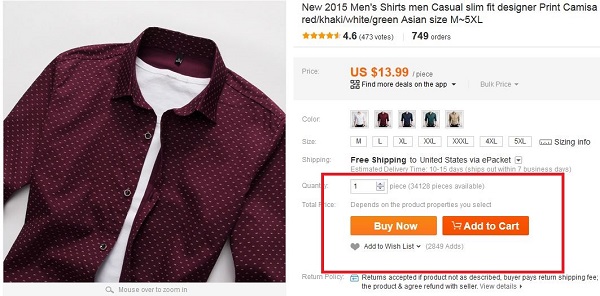
I mean, you can easily tell the difference between this product page:
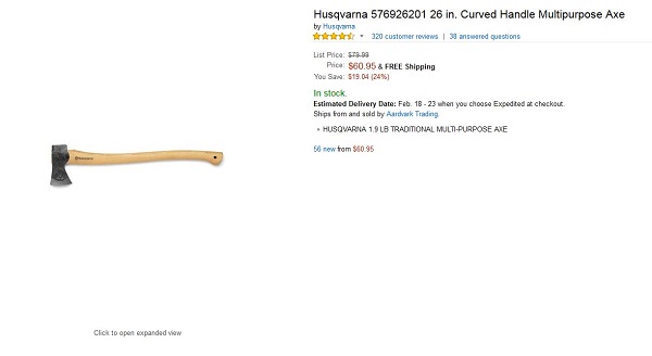
And this one:
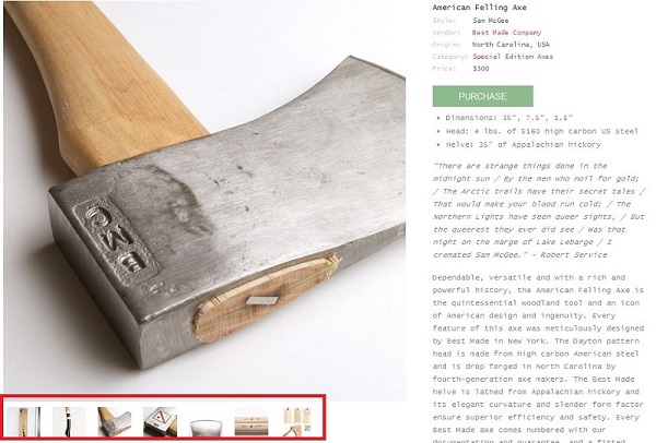
You can easily tell which one looks best and will consequently attract more customers and sell more.
It’s also a good idea to add a watermark to your pictures in order to prevent them from being used elsewhere without your permission (such as for online scams).
For instance, scammers these days tend to use stock photos of flats and houses and try to pass them as places that are for rent. This may cause a general sense of distrust towards all sellers, including honest ones. Watermarks will reassure customers and avoid this kind of internet scam.
Pro tip: Offering some kind of preview is a basic need for all kind of products, even in cases when you might think they would be irrelevant. For instance, in case you are selling audio/video learning courses, a short video or audio file is needed in order to check out the quality of the product you are selling.
2) Use the short description wisely
One of the most common mistakes in these cases is considering a short description as a preview of a longer one.
Truth is the small space underneath a product’s name should not be used to generally describe it , but to encourage customers to buy it instead.
That’s why a good short description should answer three simple questions:
- What are you selling? Be clear and direct, indecisive customers have no time to waste.
- Why do I need this product? Display the advantages customers would gain from buying it, show them it is worth more than what they are paying for it.
- Why pick this specific product/service over others? Your products are the best around, your competitors have no chance against them. Make it clear to your customers.
3) Have a clear and noticeable call to action button, set apart from the rest of the layout.
Once your product is set in your customer’s mind, you need to use those few remaining seconds to convince them to buy it.
That’s why it would be a good idea to highlight the purchase button, to make it more visible and stand out from the rest of the page.
A good way to obtain this result is to use a different color from the rest of the layout that would make the call-to-action button stand out and will focus the viewer’s attention.
In my experience I recommend using a bright color such as red or orange, but only in case these are not the main colors of your website.
4) A comprehensive description
If a good short description is of basic importance to convince customers, the long one must answer any possible question customers might have.
A good description turns a two dimensioned photo into a statue people can analyze in every single aspect and detail, that they can look around and finally get convinced they have finally found what they were looking for.
That’s why it should contain:
- An in depth description of the product, including instructions in PDF (whenever required).
- A size table in case of a clothing store.
- Assembly instructions in case they are required.
- Additional images.
- Tips for its use.
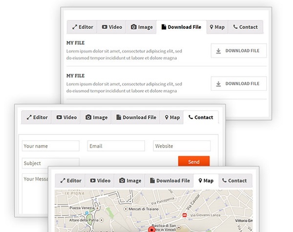
In order to handle all this data without confusing customers I suggest you use the Tab Manager plugin, which allows you to divide the required information fields into several tabs, making them quick to track and allowing the product page to be more effective thanks to this system.
A FAQ tab is very important as well and it needs to contain all of the most common questions related to your product and their answers, which will prevent customers from calling your customer service and having to wait for an answer.
As I remind readers in almost all of my articles: the average customer is lazy, don’t make them work longer than they need to.
Remember to answer all the most important questions, such as:
- Can I afford it?
- How does it work?
- How do I know it’s good quality?
- Who else uses it?
5) Avoid using sidebars!
As a last piece of advice, here one thing you should NOT do: don’t use a sidebar on your product page.
Not only they are basically useless (studies show that only 0.3% of customers looks or interact with them) but they can even damage your sales.
It’s never a good idea to divert the customer’s attention to something else. Adding more elements to your page can make it look chaotic and bring the customer to leave your store, thus losing a potential sale.
And this is how you were able to create a WooCommerce product page that’s capable of much higher sales!