 30 DAYS MONEY BACK GUARANTEE
100% refund if you are not satisfied
30 DAYS MONEY BACK GUARANTEE
100% refund if you are not satisfied


Like Uber Eats, Just Eat, Deliveroo, and any more take-away ordering sites, you can easily create your online ordering system with WooCommerce.
Let’s look at what some of these super-popular take-away and delivery companies do and how they manage the user experience.
The concept is that users can choose a range of meals, drinks, and snacks to be delivered from a wide range of nearby restaurants. The ordering process is simple, intuitive, and the next step to check out is available to increase the conversions.
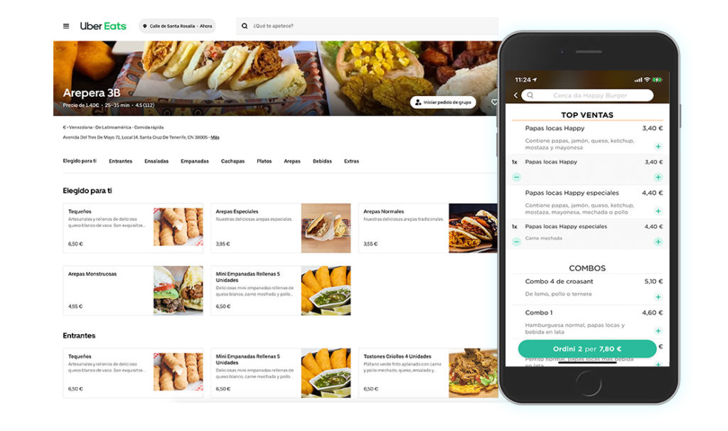
In this example of Uber Eats, the grid layout is very clean and straightforward, without the need to jump from category pages, as you would typically do in a traditional e-commerce store to select the quantity and add this to a basket. Everything is on one single page. At the top of the grid, you have the categories from which you can jump to each section. This is really useful when using a smaller screen and you get lost scrolling past too many items.
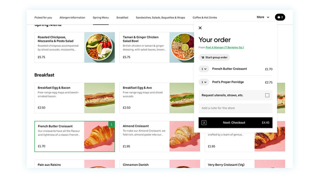
As soon as you add items to your order, a slide-out ‘basket’ appears from where you can see your total and click on the next step to checkout.
The importance of the mobile view
The reality is that most people will order on the go or from the comfort of their settee, so an excellent mobile experience should also be the focus of your project. Also the big companies, show that they’ve put some serious thought into the experience when ordering on a mobile.
In the mobile view, you can increase the quantity for each item (just take a look at your standard WooCommerce installation and how it looks on a mobile phone to remind you of how different it is), and also in the mobile view, the cart button is clearly visible.
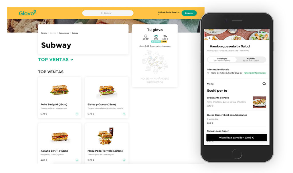
In the example of Glovo, you see that a two-column grid layout is used with images, price, and quantity buttons.
The mobile version of this site also has a sticky total and checkout button to ensure the customer can quickly move to the next step and order the food.
All examples look very nice and intuitive to use, right?
– An organized grid or table view, images, description, and quantity buttons;
– A slide-out cart with totals and direct access to the checkout page;
– A quick view with additional items info;
– A responsive mobile view.
Well, the good news is that you can create a very similar-looking page using WooCommerce and just one plugin.
How to create a single-page shop and ordering page
Do you start from scratch and without having installed WooCommerce? If so, you can follow our tutorials on installing WooCommerce and the Free WooCommerce Proteo theme first. Installing WooCommerce and Proteo will give you the instant capability to sell and make the store look and feel good within minutes.
Once you have done this or already have a WooCommerce optimized theme set up with your products, we can look at creating the single ordering page in five steps.
Step 1) Install the Easy Order Page plugin
First, you need to install the YITH WooCommerce Easy Order Page plugin. With WooCommerce alone, you cannot easily create a similar-looking one-page layout unless you use various tools and page builders. So today, this is the best option to control every design and functionality aspect of your ordering page like the examples we shared at the beginning.
Once installed, activate your license and head to the YITH > Easy Order Page menu tag.
Step 2) General settings to get the single order page setup
There is a good chance you will visit this page several times as you experiment with the functionality, but within the ‘general settings’, you can find things like variations to display, cart widget positions, and whether to show the ‘total’ plus more settings. It is good to familiarize yourself with the options first so that when your page shows up, you know why certain parts either show or don’t.
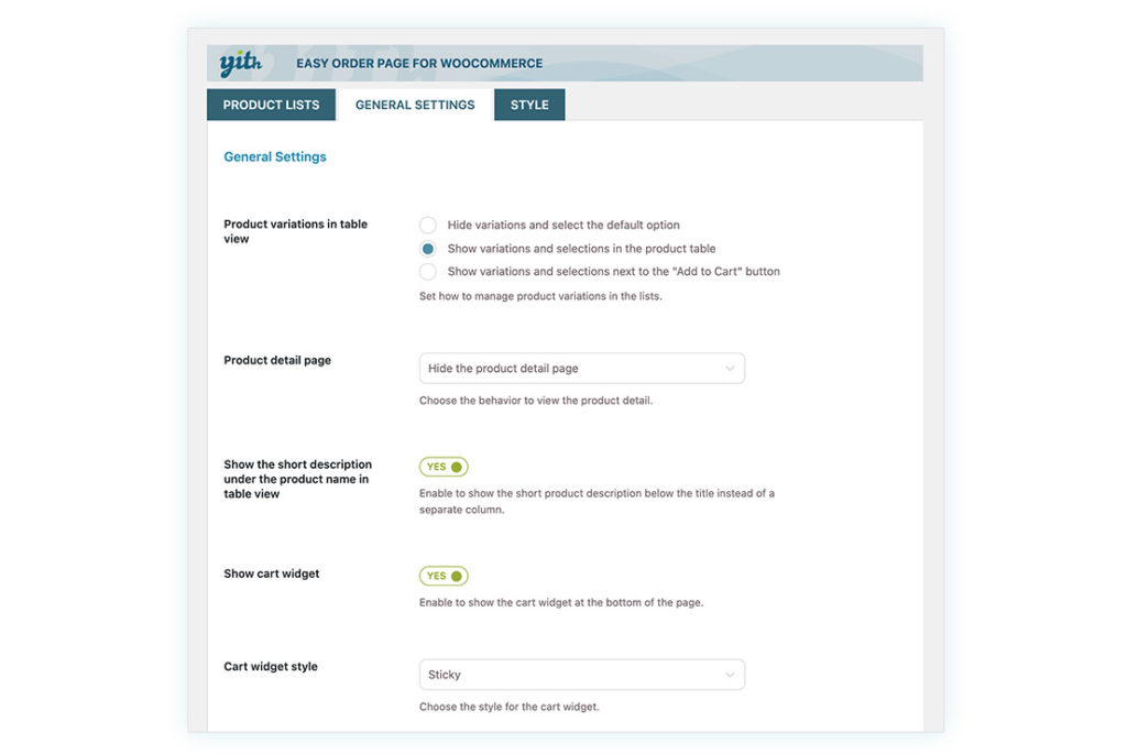
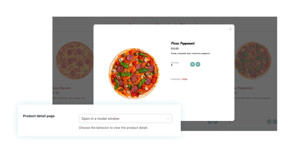
From the product detail page, you have the option to show product details in a modal window. This is particularly helpful when listing ingredients, for example. In this way, the customer will stay on a single page and can view the most important information easily, without navigating away and opening a single product page.
Step 3) Add your products to the list
Now let’s create your first list of products. From the ‘product lists’ tab, you can ‘add list’ and give it a name.
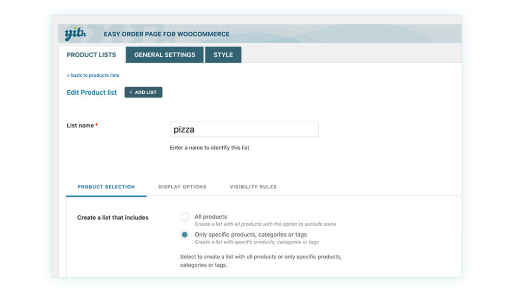
From the three different tabs, you can control what products are shown. Choose them by tags, categories, and which ones to exclude, or just add them individually.
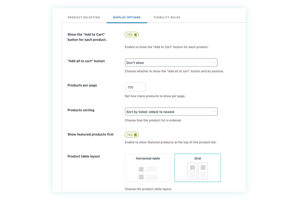
Under the display options, there are many more settings for the layout. You can choose between a horizontal table layout or a grid layout. We will continue using the grid layout, simial to Glovo. The number of columns depends on your theme layout and on screen width the page is viewed on. Furthermore, you can select ‘add to cart’ and many more display settings for the product elements.
The visibility rules tabs let you decide who can see this product list; this can be useful if you require guests to create an account and sign in first or create a membership plan for special discounts.
For more detailed settings, you can view the plugin’s documentation or experiment using the demo with three different shops set up.
Step 4) Create your single shop page
After you’ve created the product list, you need to create a page visible to your customers.
You can add the product list shortcode or use the Gutenberg Block to display the grid or table on any page. Shortcodes are particularly helpful if you use a page builder like Divi, Elementor, or Beaver Builder. If you use widgets, you will not have any issues either.
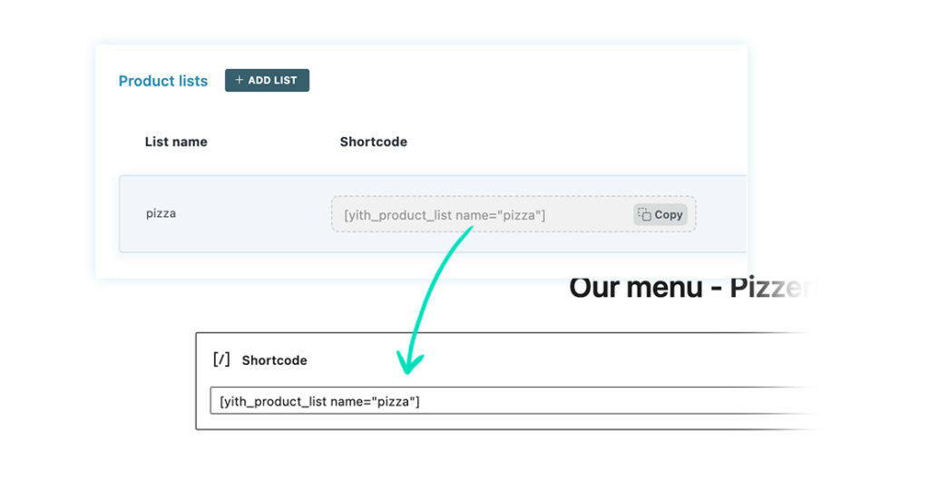
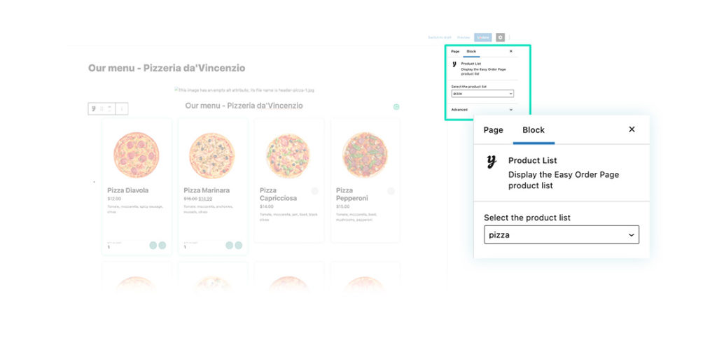
Once you’ve added the shortcode or block, save this page and view it from the front-end.
Step 5) Style it and optimize the page for mobile views
Now that you see what the customer experiences, there is no doubt you want to make some adjustments. Some key features are part of the general settings or are part of the product-list settings.
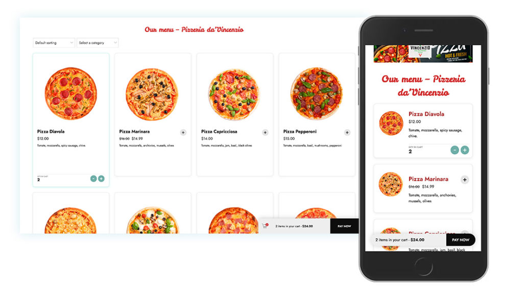
In the example, you see that four columns turn into a single column on a mobile with a cart widget visible at the bottom of the page. From the ‘Style’ tab, you can change the color of the widget, cart buttons, change or upload your icons, and many more styling options.
The importance of optimizing it for mobile is crucial, as we mentioned at the beginning of this tutorial. Even the table-view will completely adjust to mobile screen size to give the user the best possible experience.
Create the complete ordering and delivery process
Adding more functionality can be achieved with other YITH plugins. The plugins are built using a single framework, making sure they are fully compatible and extendable. For example, you can:
- create an optimized registration process to increase conversions, using the Easy register and popup for WooCommerce plugin.
- Create a delivery or local pick-up option for your shop with YITH Delivery Dates for WooCommerce; check out this ‘level up your store’ blog.
- Create discounts and special offers like ‘buy one get one free’, with YITH Dynamic Pricing and Discounts for WooCommerce.
- Do you want to limit when people can order from your restaurant? By adding YITH WooCommerce Catalog Mode, you set dates and times when products, or product categories, can be bought from your store.
- Create a loyalty program with YITH WooCommerce Points and Rewards. So for every order placed, the customer can earn points, which can be exchanged for free side orders or drinks, the next time they order.
More integrations are being developed, and if you are planning for a different or complex setup, don’t hesitate to reach out to our customer support.
Investment to build a site like Uber Eats, Grubhub or Glovo
One thing we know is that the original examples like Grubhub, Uber Eats, and Glovo don’t use WooCommerce, but instead use a custom platform at an immense cost. Most startups don’t have the budget to invest in a team of developers and a custom app. So for a minimum investment of a few plugins, you can pretty much create the same functionality, look, and ordering process as the big food ordering companies.
With just a few orders worth, you will have a return on investment by creating this functionality for your restaurant or takeaway. By doing this, you pivoted into a new revenue stream and customer base. But best of all, you no longer need to pay for excessive revenue shares to the big food delivery companies.
All of the control is with you, giving you the flexibility to be more competitive, and offer better customer service, design and functionality.